You may have noticed some changes happening in the Temeda app. Since we are constantly working to make our product work for you, we have planned a series of improvements to our application — both in the way things load and the way things look.
As we keep working throughout this year, you should start to notice some benefits:
- Faster loading times and data crunching
- Easier and more intuitive navigation and improved user experience
- Modern look and feel
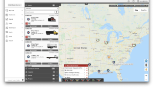
Our next update will look a little different: the visual layout has changed, but the structure remains virtually unchanged.
- Navigation menu is now on the left side, instead of across the top of the page.
- Each menu item clicks open so you can easily browse, instead of needing hovering over them.
- Tip: You can minimize the size of the navigation menu by clicking the arrow at the bottom of the menu.
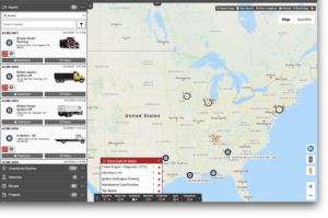
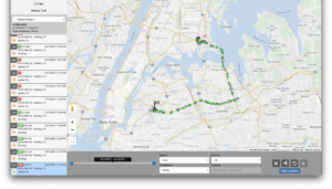
- The map has been flipped: the Accordion now lives on the left side of the screen, and map options and settings are on the right. We hope that having all your navigation on one side helps you browse your assets more quickly.
- User Profile settings, Change Password, and Logout are now a dropdown under your username, in the top right corner of the screen.
- We are switching to icons that have greater visibility at small sizes.
| Feature | Original | Updated |
|---|---|---|
| Navigation menu (all) |  |
|
| Navigation menu (Maintenance) | 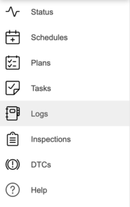 |
|
| User settings | 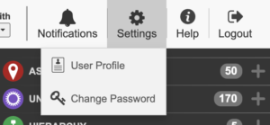 |
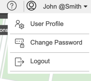 |
| Map | 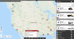 |
 |
| Full view | 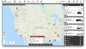 |
 |
| History trail | 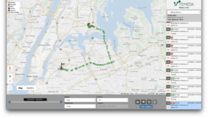 |
 |

